Artbeads offered us bloggers a chance to try out some supplies* & design a summer theme. My first instinct is to gravitate toward blues, yellows, pinks, white: bright colours & pastels. Then I stopped myself. That is my assumption of summertime jewelry. But what does summer mean to me?
I grew up in Nova Scotia, so the ocean was never far away. But I grew up in the Annapolis Valley – so the ocean was not the prominent landscape. Now that I live in Québec, I live near a lake. So there is indeed water, but like the muddy banks of the Bay of Fundy, it is not the crystal clear blue/green water you will see in the Caribbean. It has more of an earthy quality.
Thinking of where I spend most of my time in the summer months, I like to be outside in my garden: either working with the dirt or relaxing in the shade when it’s too hot. I like to observe the plant life and insects as they exist in harmony with one another.
In the summer, you will see me in a lot of khakis, earth-toned capris & shorts: tank tops – very simple & casual. If I go out to an event, chances are you will see me in a simple black dress and black thong sandals. So it occurred to me – what summer means to me: spending time connecting with the earth & casual socializing.
After this contemplation, I decided to choose two pendants from Artbeads that I thought most represented me in the summer months.
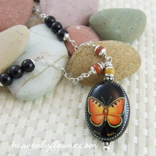
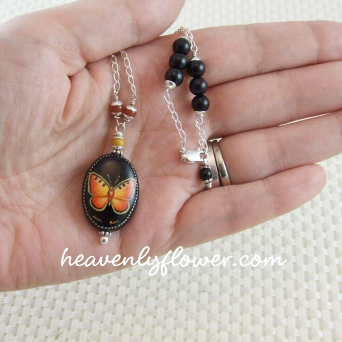
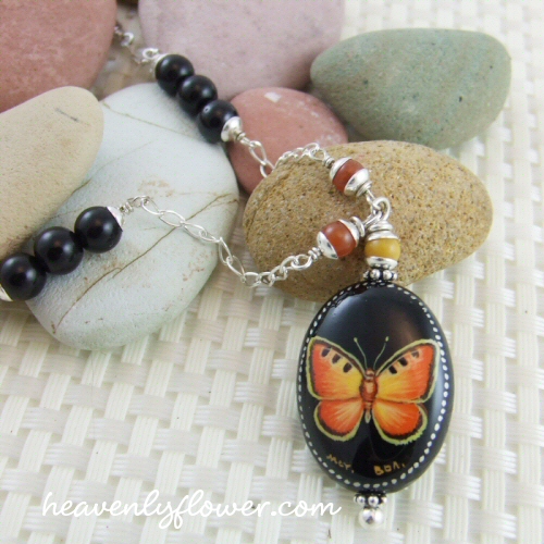
This 18x25mm onyx pendant is hand painted with a butterfly by a Russian artist. Butterflies are very symbolic for me: they represent beauty in nature, as well as transformation – something I strive to do many times in my life. This pendant would be perfect in a casual outfit or little black dress.
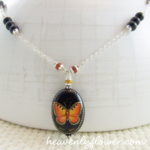
As mentioned in my last post, I had a hard time choosing colours for this piece. I just have too many hues of yellow & orange in my vast stash of beads! I ended up going with just a splash of colour with these 4mm jade beads. Too much colour with the black onyx and it would look too halloween-ish or bumble bee-ish! Plus I wanted the beauty of the pendant to take center stage & not get lost in a sea of bright colour. So I used mostly onyx beads (6mm and 4mm), sterling silver chain & bead caps.
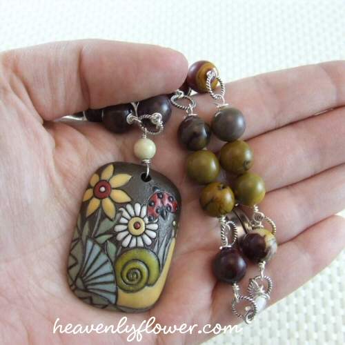
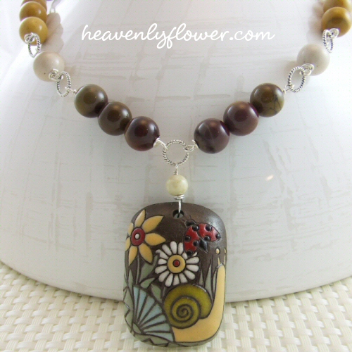
When I approached the design for the second pendant, I didn’t have to look far for the perfect matching component. Something about this stoneware pendant reminded me of a particular bead. Was it wood? No. It would have to be a stone, with many different colour layers. Then it hit me: Moukite!
Moukite (or mookaite, “mook jasper”) is a type of jasper found in Australia. I love this stone for it earthy colours & broad patterns – anywhere from reddish-brown, gold, white, or even mauve/pinks! It was the perfect compliment to this pendant, which is made of glazed stoneware clay.
The pendant easily accommodates the 10mm beads. I decided to break up the bulk of the beads & add interest with these 8mm sterling silver twisted rope jump rings, mainly because they reminded me of the pattern of the white flower in the pendant.
I thought I’d share a tip: I wanted the rings to lay flat on the neckline. In order to achieve this, I had to pay close attention to the pattern. I noticed that I had to twist the loop wraps around the single beads (the group of three beads have their loops facing the same direction). I had to make sure that the wrapped loops on the single beads were alternating: meaning, instead of them facing the same direction , I needed to have one facing outward. Here is a picture that hopefully will illustrate what I mean (sorry it’s a bad picture):
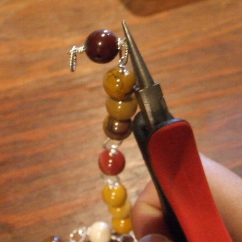
I held the loop to the left with my fingers, then gently twisted the loop on the right with my pliers 90 degrees. This variance in the loops means the rings laid flat against my neckline instead of sticking out uncomfortably.
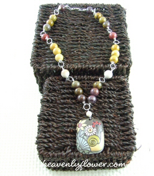

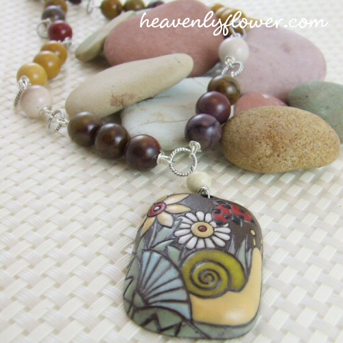

I like these. Simple designs do best, letting the air flow around them and not adding weight other than the design.
We come from the earth, so it is the earth that we need to look to. The ‘lace’ of a leaf or a butterfly. The earth colors that anchor, the light colors of the air. These are the things that we see, and the things that bring comfort
Good job!
Lyne, thank you so much for looking and appreciating where I come from…it’s nice to connect with the earth for sure! I try to be consciously do it as much as possible esp. in the warm weather – so easy to stay inside and disconnect in our society!
Thanks for stopping by!
Leilani 🙂
I’ve nominated you for the Kreativ Blogger Award!
Leilani – I always enjoy your perspective on things as well as your unique creativity. These two pieces remind me of what I feel about summer too. My instincts always lead me to the bright and bold, but year round not just at summertime. When you explained, I could feel and smell the garden and the earth and the beauty of the insects that keep it all growing. The wonderful dark, earthy tones and the softness of the other colors are so pleasing and comforting. The designs very thoughtful and wonderfully executed.
Beautiful. Thank you for the moments of pleasure you share so generously. Hugs sweet lady.
Margie – thank you!
I often wonder if my word are lost on others – I have such a passion and inner drive to share but I wonder if my words are really heard. It’s wonderful to get validation like yours to know that there really is a reason for it all. 🙂 Thank you for reading & appreciating – hugs to you – you are such a light in this world! XO